Payment Form Settings
8 min read
Payment Form Settings
Payment Form settings are configured individually for each custom payment form you create. These settings control the appearance, behavior, and functionality of standalone payment forms that can be embedded anywhere using shortcodes.
📋 General Tab
Core settings that define what products the form sells and how it processes payments.
Required: Yes
Purpose: Choose which WooCommerce products this form will sell
Required: Yes
Purpose: Choose which payment gateway processes payments for this form
Default: Off
Purpose: Allow logged-in users to use this payment form
Default: Send verification code
Purpose: Choose email verification method for guest users
Purpose: Control customer name collection
🎨 Style Tab
Visual customization options to make the form match your site’s design and branding.
Default: Two Columns
Purpose: Choose the overall layout structure
Product info and form fields stacked vertically
Product info on left, form fields on right
Default: Display above the form
Purpose: Control where form title and description appear
Purpose: Hide specific parts of the form for customization
📝 Texts Tab
Customize all text elements displayed in the payment form to match your language and tone.
Form Content Management
Title and Description
Each payment form has a title and description that you can edit using the standard WordPress editor:
- Title: Entered in the standard WordPress title field
- Description: Added using the WordPress content editor (rich text)
- HTML Support: Full HTML and WordPress formatting supported
- Media Support: Can include images, videos, and other media
Best Practices
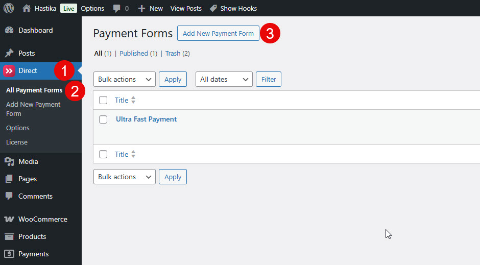
Create a Custom Ultra-Fast Payment Form
To create a custom payment form, go to the Direct / New Payment Form menu.
You can also go to Direct / All Payment Forms and click on the “New Payment Form” button.
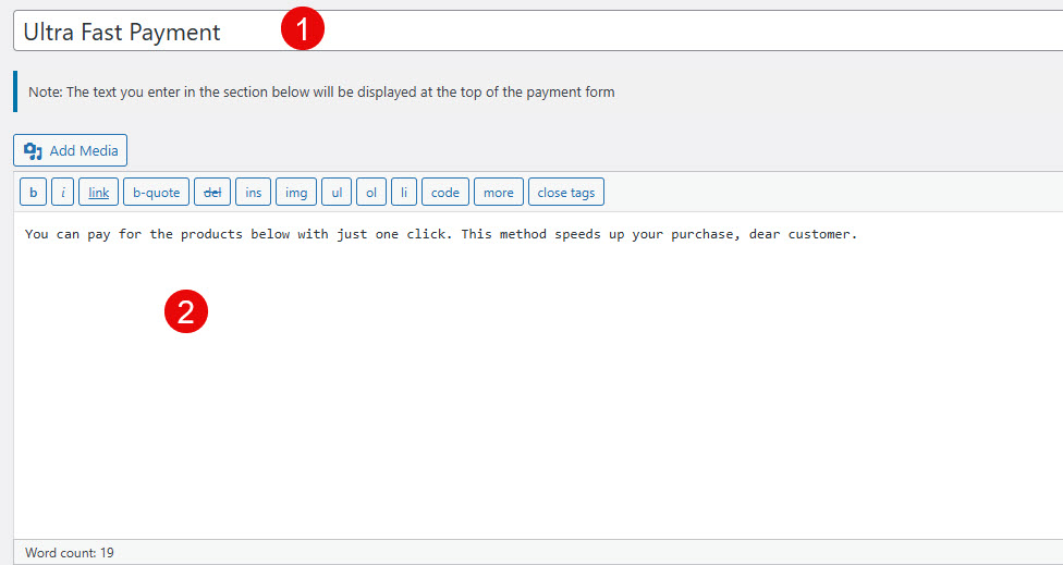
On the opened page, in the first box enter the payment form title, and in the large editor box enter your desired description for the form.
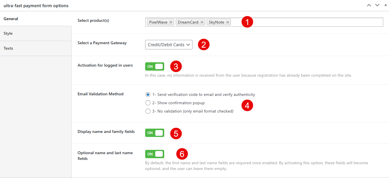
Genral Options
- Select product(s): This setting allows you to select the specific products for which this payment form will be used. You can add or remove products from the list.
- Select a Payment Gateway: Here you choose the payment gateway that will process the payments made through this form. The screenshot shows ‘Credit/Debit Cards’ is selected.
- Activation for logged in users: When this option is enabled, the form will be active for users who are logged into the site. No information is received from the user because they are already registered.
- Email Validation Method: This setting lets you choose how the user’s email address will be validated. The options are sending a verification code, showing a confirmation popup, or only checking the email format without further validation.
- Display name and family fields: Enabling this setting adds fields for the user’s name and family name to the payment form.
- Optional name and last name fields: If you activate this option, the name and last name fields, which are normally required, become optional, allowing the user to leave them blank.
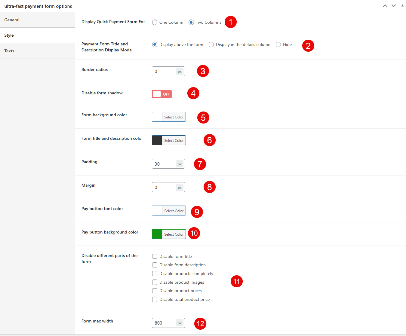
Style Options
- Display Quick Payment Form For: This setting controls the layout of the payment form. You can choose between ‘One Column’ or ‘Two Columns’.
- Payment Form Title and Description Display Mode: Here you can decide where the form’s title and description will appear. The options are ‘Display above the form’, ‘Display in the details column’, or ‘Hide’ them entirely.
- Border radius: This field lets you set the roundness of the corners of the form’s border in pixels (px).
- Disable form shadow: This is a toggle switch to turn off the shadow effect around the payment form. The current setting is ‘OFF’, meaning the shadow is enabled.
- Form background color: This option allows you to select the background color for the payment form.
- Form title and description color: This setting lets you choose the text color for the form’s title and description.
- Padding: You can enter a value in pixels (px) to set the inner spacing between the form content and its border.
- Margin: This field allows you to set the outer spacing around the payment form in pixels (px).
- Pay button font color: This setting is for selecting the color of the text on the payment button.
- Pay button background color: Here you can choose the background color of the payment button.
- Disable different parts of the form: This section provides several checkboxes to disable specific elements of the form, such as the form title, description, products, product images, product prices, and the total product price.
- Form max width: You can set the maximum width of the payment form in pixels (px).
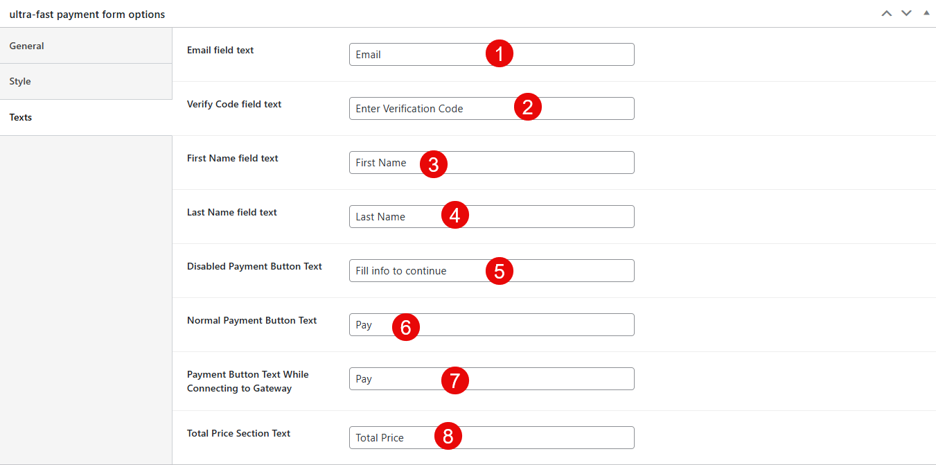
Texts options
- Email field text: This field lets you customize the placeholder text for the email input field on the form.
- Verify Code field text: Here you can change the text for the verification code input field.
- First Name field text: This option allows you to edit the placeholder text for the first name input field.
- Last Name field text: You can customize the placeholder text for the last name input field here.
- Disabled Payment Button Text: This setting lets you set the text that appears on the payment button when it is disabled, typically before the user has entered all required information.
- Normal Payment Button Text: Here you can change the text that is displayed on the payment button when the form is ready for submission.
- Payment Button Text While Connecting to Gateway: This field allows you to customize the text shown on the button while the form is connecting to the payment gateway.
- Total Price Section Text: You can edit the label text for the section that displays the total price of the products.
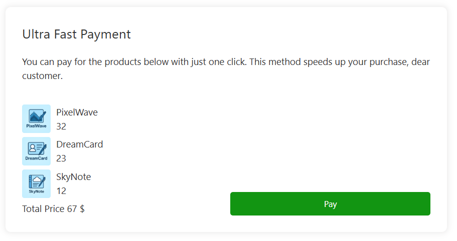
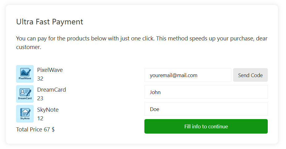
Preview – Guest User – Two Columns
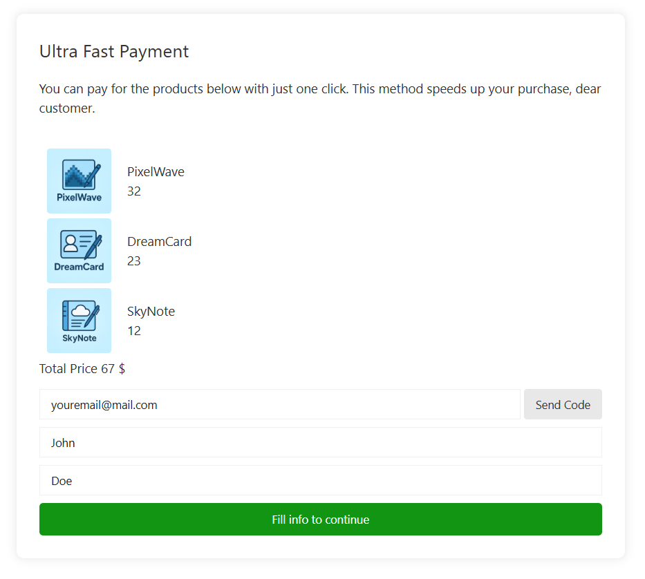
Preview – Guest User – One Column
Preview – Logged in Users