Account
Loading...
Cart
Text Settings
1 min read
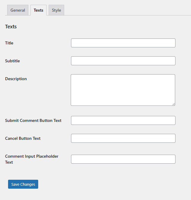
The Text settings tab allows you to customize all visible text content in the comment form. This enables you to match your brand voice, translate content, or adjust messaging for your specific audience.
Available Text Settings
Title
Field Type: Text input
Purpose: Main heading displayed at the top of the comment form
Where it appears: Clickable header that expands the comment form
Purpose: Main heading displayed at the top of the comment form
Where it appears: Clickable header that expands the comment form
Default: “Please support us by submitting your valuable comment in less than 1 minute (click here)”
Example alternatives:
• “Help others by sharing your product experience”
• “Leave a quick review for your recent purchases”
• “Your opinion matters – share your thoughts!”
• “Help others by sharing your product experience”
• “Leave a quick review for your recent purchases”
• “Your opinion matters – share your thoughts!”
Subtitle
Field Type: Text input
Purpose: Secondary text displayed below the main title
Where it appears: Optional subtitle area in the form header
Purpose: Secondary text displayed below the main title
Where it appears: Optional subtitle area in the form header
Default: Empty (no subtitle displayed)
Example usage:
• “Your feedback helps improve our products”
• “Share your experience with other customers”
• “Reviews help us serve you better”
• “Your feedback helps improve our products”
• “Share your experience with other customers”
• “Reviews help us serve you better”
Description
Field Type: Textarea
Purpose: Detailed explanation or instructions for users
Where it appears: Inside the expanded form, above product list
Purpose: Detailed explanation or instructions for users
Where it appears: Inside the expanded form, above product list
Default: Empty (no description displayed)
Example content:
• “Please share your honest opinion about the products you’ve purchased. Your reviews help other customers make informed decisions.”
• “Rate your recent purchases and let others know about your experience with these products.”
• “Please share your honest opinion about the products you’ve purchased. Your reviews help other customers make informed decisions.”
• “Rate your recent purchases and let others know about your experience with these products.”
Submit Comment Button Text
Field Type: Text input
Purpose: Text displayed on the submit button
Where it appears: Green submit button in each product’s comment form
Purpose: Text displayed on the submit button
Where it appears: Green submit button in each product’s comment form
Default: “Submit Comment”
Example alternatives:
• “Post Review”
• “Share Opinion”
• “Submit Feedback”
• “Send Review”
• “Post Review”
• “Share Opinion”
• “Submit Feedback”
• “Send Review”
Cancel Button Text
Field Type: Text input
Purpose: Text displayed on the cancel button
Where it appears: Orange cancel button that closes the comment form
Purpose: Text displayed on the cancel button
Where it appears: Orange cancel button that closes the comment form
Default: “Cancel”
Example alternatives:
• “Close”
• “Nevermind”
• “Skip”
• “Not Now”
• “Close”
• “Nevermind”
• “Skip”
• “Not Now”
Comment Input Placeholder Text
Field Type: Text input
Purpose: Placeholder text shown inside the comment textarea
Where it appears: Gray placeholder text in the comment input field
Purpose: Placeholder text shown inside the comment textarea
Where it appears: Gray placeholder text in the comment input field
Default: Empty (no placeholder text)
Example placeholders:
• “Tell us about your experience with this product…”
• “How was the quality? Would you recommend it?”
• “Share your thoughts about this purchase…”
• “Write your review here…”
• “Tell us about your experience with this product…”
• “How was the quality? Would you recommend it?”
• “Share your thoughts about this purchase…”
• “Write your review here…”
💡 Customization Tips
- Keep it concise: Shorter titles get more clicks
- Be encouraging: Positive language increases participation
- Match your brand: Use language consistent with your site’s tone
- Consider your audience: Formal vs. casual language based on your customers
- Test different versions: Try various approaches to see what works best
- Multilingual sites: Translate all text to match your site’s language
Best Practices
- Call to Action: Make the title actionable and clear about what happens when clicked
- Value Proposition: Explain why leaving a review benefits the customer or others
- Time Expectation: Mention how quick the process is (“1 minute”, “quick review”)
- Placeholder Guidance: Use placeholder text to guide users on what type of feedback is helpful
- Button Clarity: Make button text clearly indicate the action being performed


